Monday, 6 May 2013
Wednesday, 1 May 2013
Heeral Patel – Evaluation: Question 7: Looking back at your preliminary task, what do you feel you have learnt in the progression from it to full product?
We have developed our skills
from our preliminary on how to film and use editing; there were few shots that
we had to retake as we didn’t use many transitions or different types of camera
angle. In our preliminary task there were few shots we didn’t pay attention for
example: we didn’t see the surrounding around our character, some of the shots
were out of focus which ruined some of our shots.
During this process we
learnt to improve not to use long shot because they end up losing audience’s
attention. How to flow from one shot to another: using match on action gives a
sense of continuity for this reason we decided to use this technique in our
opening sequence. When Maya gets out of
bed and she is straight in the bathroom I think this was very effective and
done well as this fits in well with the thriller theme of sudden changes
 |
| shadow image |
 |
| similar photo |
This shot of the left is very effective because we have let the
natural light from the window to create a shadow, also that I am dressed in
black n the wall on the left and right side of me where black so the lighting
from the background was a sign of hope if it was a thriller. This creates a
silhouette mysterious figure behind the camera.
 The shot on the right shows that we had a very good lining on the
floor where I was walking pass , having shot this accurate highlights the
action happening in the scene which the audience can take in account.
From this I have learnt that the image in the camera screen should always be in
line/ straight for it to look accurate and professional done.
The shot on the right shows that we had a very good lining on the
floor where I was walking pass , having shot this accurate highlights the
action happening in the scene which the audience can take in account.
From this I have learnt that the image in the camera screen should always be in
line/ straight for it to look accurate and professional done.The shot of Maya reading the paper is well composed as the newspaper is in the centre where it get the highest attention and Maya is in the ¼ of the scene.
Another shot that I thought was done accurately using composition
skills: was when Maya is in bed and the alarm is in front on the side
table to focus on the alarm clock we used the function the camera to blur
Maya’s face.


Heeral Patel - Evaluation Question6 :what have you learnt about technologies from the process of constructing this product?
http://prezi.com/zjryhlwrugba/untitled-prezi/?kw=view-zjryhlwrugba&rc=ref-39533929

Heeral Patel – Evaluation: Question5: how did you attract/ address your audience?
By
using suitable props and shots we were able to make communication with the
audience and get them to engage with our theme. As the 15+ is a for young adult
who may not be familiar with the concepts of a thriller therefore we used less
complicated visions such as the language itself or some disturbing scene.
 |
| 15+classification |
As we were making a film of 15+ we had to
check the classification for this we used the website: http://www.bbfc.co.uk/what-classification/15 where we got the information on what
and how much to include in our opening which is appropriate for that age group
, therefore there was no use of sex scene, swearing or discriminatory language .
The use of sound which was
made on imac, it was done using piano and had drums and guitar playing within it,
this created a mysterious environment. This soundtrack was played toward the
opening s we had no dialogues this make the atmosphere creepy and built up
tension of what will come next.
We didn’t challenge the
camera shots or editing as we didn’t want to make any scenes of ours
complicated, our setting that we have used for AS media is a house which makes
it all realistic, the use of dark scenes such as the bed scene, this shot to be
done in school would be very difficult as we have to be careful managing the
lighting. To represent our theme we had good use of mice en scene such as pill
box, white colour, doctor’s note , these things would appeal to the audience .
 |
| The white paper |
Due
to the questionnaire that we had done for our audience research gave us imminent
into the popular thriller themes which are used within the thrillers that are preferred.
By using an white British blonde girl in
our product which the audience could easily identify as being the main character
but yet feel sympathy towards her due to her abnormal disorder. By having no
such script in our opening made our character seem helpless and this is how we were
able to address the audience and grab their attention by making them feel a
part of it. The piano in the soundtrack had a echoing effect which created an peculiar
atmosphere, this made it recognizable by the audience as they would know the approaching
threat in the film.
Heeral Patel – Evaluation: Question4: Who would be the audience for your media product?
For our audience research we asked questions to a
certain age group of 15 to 60 years olds who would prefer a thriller films,
doing a questionnaire or any other method we can find out what the audience
best prefer to watch when choosing thriller films. By doing audience research
we are able to gather information which can help us add convention that the
audiences are most willing to see and they can relate with.
Using Microsoft excel we made our data bar chart which represented the results we gained from our questionnaires.
 |
| The majority of we asked didn't know the difference between thriller and horror. |
 |
| The majority of people we asked were from aged 16-18 giving us a clear view on what this age group would prefer |
16 to 18 was the highest percentage of young
pupil that enjoyed thriller therefore we decided to go with an age group of
15+.
Heeral Patel – Evaluation: Question3 What kind of media intuition might distribute your media product and why?

Production Company
A production company is
responsible for fundraising; it deals with scheduling, scripting and signing
artists.
Columbia picture would
be a reasonable media institution company that would distribute our product;
this picture is owned by a mainstream company ‘Sony’ which is appropriate as we
have produced a mainstream opening.
Heeral Patel – evaluation: question 2 how does your media product represent particular social groups?
Young blonde girls are often stereotyped as making little use of
their intelligence. Similarly in our opening we have a middle class girl who is
emotional unstable, weak girl who gets disturbed by the bizarre situations
occurring with her.
This idea is linked back to the film ‘the hand that rocks a
cradle’. Where the woman is emotional broken down after finding out her husband’s
affairs therefore loses her child due to stress.
.jpg) |
| The 1992 thriller film' the hand that rocks the cradles staring Peyton Flanders |
 |
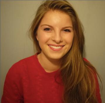
| Maya Dolman Bowles |
From our questionnaire
we asked many of our volunteer what class they belonged to?Most were
lower/middle class so for that reason we choose a character who’s an
ordinary British girl who seems closed and vulnerable.
- Peyton Flanders takes on a job of a nanny in order to destroy a woman’s happiness by stealing her family.
- She takes on this role as she can’t bare the trauma of miscarriage and her husband’s affair.
- Audience's make stereotypical views on blonde female social groups are as being less intelligent.
- Her appearance is very much similar to our character as they are both young attractive women who are mental disturbed yet unnoticeable.
Heeral Patel – Evaluation: Question1 In what ways does your media products use , develop or challenge forms and conventions of real media products ?
1-The title of the film
We planned to place the
title towards the end as it fitted with the shattered effect as the white vase
falls on the ground where the title ‘precarious’ breaks into pieces. From our
product researcher we found that the titling of the film is a key factor of
symbolizing the key theme in the film therefore we choice ‘precarious’ as it
means to fall or collapse . We decided to include the title on our last shot
instead of a slide as it emphasis on the vase dropping and the red blood as is
associated with danger The colour black over white suggest some sort of
conflict or danger which are often shown in Thrillers.
 |
| Our title with black font over white titles |
2-Costumes and props
In the opening sequence
we have used many props linked to the storyline which helps to represent a
thriller theme which we have carried out in the opening. The main colour is
white which shows innocence and purity of the whole environment which contrast
with the dark bed sheet colour covering the face and the bed being black, lifts the virtue of the girl. Also the clothes worn
by the girl are quite dull in colour which has no sign of patterns or designs
helping us keep the white theme ongoing. Props that we used are pill box,
appointment sheet, alarm clock and a vase all symbolized with the illness our
character is facing. These props are good representation of the film genre as
thriller conventions often use dark objects to epitomize.
 |
| The white colour of the flowers and her clothing |
 |
| An example of dark bedding which emphasis dark hidden secrets |
3-Setting/location
We filmed at a house
with limited location as we didn’t want to give too much detail or much of her
surroundings. Using a setting such as the house makes it more realistic and
showing a deep perception of the character as she is a patient. Having to film
at day time for night scene we had to be really careful of the amount of light
we had in our shots. To challenge this we used a bedside lamp to put a glow on
her face which reduced graininess from our shots. The whiteness of the table
reflects the yellow light from the lamp really well as it wasn't as
bright or dull. This added an gloomy effect in the surroundings which
contrasts well with the dreamy shots.

 |
| a close up shot of the blood shoulding the contrasts of red against white floor. |
4-Camera work and
editing
We wanted to show that the
props we have used are symbols of the girl’s life, therefore; we pan the side
table where we had the pill box and the doctor’s note. Also To show our
character’s insight, for this we zoomed into her face along the side table .We
have used variation of shots to emphasis the anxiety of our character.
The use of red against the white tiles puts a brighter glow on the red
blood. The use of editing: where we as
the audience can see water whereas she can see blood. This is a very effective
way to show that the girl is mental disturbed.
this is real media product which is completely different opening sequence
to ours as its doesn’t reveal much of the character
5-Title font and style
The font ‘zapfino’, was
an appropriate font for our theme because it fits in with the title precarious
of clumsiness. We wanted an handwriting effect on the names of director ,
editor and music by , this idea was originally found on the doctor’s note we
signed by hand this was an inspiration to continue this idea onto our
opening.
This sort of font is often used in genre such
as thriller or horror as it associated to mysterious themes and also makes the
writing stand out.
.jpg) |
This font is often used in Shakespeare films, this gives an
old but gives an effective and professional style.
|
6-Story and how the
opening sets it up
The shot of the
newspaper on the carpet, we used this to build up some sort of tension and how
it implies to her real life. The image on the newspaper is the same as our
character’s face which is abit unusual setting up a bizarre situation for our
plot.
By showing our main
character at the beginning of our shot, it was essential for the story which
can be understandable by the audience, also to introduce a story and how it
will be presented.
We used cutaway shot of
the dream over a shot of a sink this highlights the abnormality of the girl.
This product here shows a taxi driving on a busy night roads, which is from the drivers's point of view which suggest to the audience that the taxi plays a signification role in the film
7-special effects
For special effects we
used ‘cutaway’ this was used to create an effect of a flashback where the
character
Is laughing behind a
shot of a sink containing knife this creates a atmosphere of agitated and physically
disturbed character
 |
A
shot of knife under a light glow shot of the girl implies danger to the girl .
|
Sunday, 14 April 2013
Eve Dolman-Bowles - Evaluation: Question 7: Looking back at your preliminary task, what do you feel you have learnt in the progression from it to the full product?
From the
preliminary task, we struggled a bit, as we concentrated a bit too much on
shots, for example her walking to the place, rather than match on action or shot
reverse shot, so we started again and made sure we got the right shots. We
learnt from this and we used our new knowledge to know its better to have a
really good quality shot rather than a long meaningless one. We also learnt how
to create a realistic looking conversation between two people and how to make
editing flow from one shot to the other, for instance in our full product, the
protagonist wakes up from her alarm and in the background you can see her
getting out of bed, we then move to a long shot, to continue her actions of
getting out of bed, this creates a bigger frame and the audience can see more.

We spent a bit to long at first, with a long of progressive shots like this one, we found they were a waste of time.

Match on action creates a flow from one point to another. This is easier to portray than we expected and because of this, we used it in our full product, as we liked the effect it gave.
From our preliminary task, we also create storyboards, which made the process a lot simpler because we could refer back to it when we were filming. For our final product we did the same which also helped a lot and made it easier to create the product because we could visualise what we wanted.
I hadn't used iMovie in a awhile and the preliminary task defiantly helped me get used to things again, where things are and the effects i could create. When editing our preliminary task, we saw how simple it was to create a match on action and shot reverse shot effect. This helped us in our final product when we created a jump cut.
Eve Dolman-Bowles - Evaluation: Question 6: What have you learnt about technologies from the process of constructing this product?
iMovie was a very helpful tool in helping us edit our product, as it it simple yet creates a great quality looking piece. We could create effects that made our thriller look a whole lot better, as it added extra feeling of suspense and fear, for instance with the knife shots.
After effects had such an impact on our product, it helped us create a more realistic looking product and we learnt to experiment with different titles and effects and the outcomes of them. At first we were a bit slow to start, learning all the tools and features, but once we practiced, we got used to it and were able to produce good results.
The use of the Camera was tricky at first, because we weren't able to film a good quality looking shot in dark light as it came out grainy. However the camera was very easy and simple to use and hold, which helped us shoot shots easily, we used the HD Canon.
We also decided we would get better results if i were to film with my camera, the Lumix GF2 HD. This created excellent looking shots in HD, which made the product look very realistic and the results were an improved from before.
Another technology we used was YouTube, this allowed us to do a lot of product Research on other thriller openings and gave us ideas about what we wanted ours to look like.
We aslo watched a lot of tutorials for after effects for our titles, this helped us a lot and we learn how to use after effects as a result also, which made it very easy to create.
YouTube also allowed us to show our products we created, such as our preliminary task, rough cut, final cut and also when experimenting with after effects
Here we created an idea of what we wanted our titles to look like, through youtube we were able to present this onto our blog and show our progress. Although this wasn't our final decision, it helped learn how to use after affects and the outcomes.
Eve Dolman-Bowles - Evaluation: Question 5: How did you attract/address your audience?
 |
| Classification of 15+ was a perfect audience for us, because it allowed us to imply a form of violence has occurred |
We classified our thriller product for ages 15, we looked up what this can and cannot include. the 15 classification didnt restrict us because we wouldnt be making scenes that involved drug taking, sex or strong language.
Also we did some audience research, we created a questionnaire asking questions we really felt would help improve our product after showing our rough cut to a group of our target audience. We also got feedback about what they thought. They thought some shots were too grainy, change the clock to one that fits the genre. An example of an improvement we made from this feedback was in the bedroom scene to change the lightening, make the room darker but with a slit of light shining through the curtains onto Mayas face. So we made improvements in terms of what the audience felt would look better and what would appeal to them for a thriller genre. We also recognised faults ourselves, and took it upon ourselves to improve them, and example of one was to reshoot the dream scene to make it more recognisable that it’s a dream.
Eve Dolman-Bowles - Evaluation: Question 4: Who would be the audience for your media product?
We found out that the majority of people were working & middle class. The majority of the results also showed they didn't know the difference between a thriller and a horror and that they felt music was very important because it gives the thriller a sense of mystery and tension. Also that they eenjoyed the genres thrillers, horrors and comedies.
 |
| The majority of people couldn't distinguish the two genres |
 |
| Music is very important for the audience, asking this question, gave us the idea that the audience do acknowledge music and find it very important. |
 |
| Thriller was one of the top 3 genres, this questions gave us a clear idea of what genres people enjoyed. |
Eve Dolman-Bowles - Evaluation: Question 3: What kind of media institution might distribute your media product and why?
A media institution that would be best to distribute our product would be
paramount pictures, Universal or Lionsgate as they distribute films that are
mainstream, they cater for the wider audience and they use conventions of the
thriller genres that people expect to see and enjoy.
We named our media institution ‘on
air productions’ as it is a conventional term, used by many mediums, such as
radio & film, etc. We edited it, using after effects, to create
realistic looking titles. We found a tutorial on YouTube for an effect called
shine and we thought it would suit our product.
 |
| Logos of On air productions, Paramount pictures, Universal and Lionsgate - all mainstream media instituions |
Eve dolman-Bowles - Evaluation: Question 2: Does your media product represent particular social groups?
 |
| In the thriller 'The Birds' Tippi is portrayed as a very sophisticated young attractive women, however when she comes in a situation that she is unaware of and it creates fear for her, she cant protect herself and therefore her man does this for her. This makes her look weak and powerless. |
 |
| Maya is a young attractive girl, which instantly makes her weak and powerless to the audience, and this is what they like to see in the thriller genre, because it mean she will struggle and this makes the audience what to watch more, because they want to know how she battles out of it in the end. |
Eve Dolman-Bowles - Evaluation: Question 1: In what ways does your media product use, develop or challenge forms and conventions of real media products?
Our product research help us create ideas about how we
wanted out media product to look like. We watched openings like Se7en and Cape
Fear and they gave us an insight about the themes in the thriller genre; being unkown, uncertainity and fear. in out thriller, we used the same themes in order to create a mainstream thriller.

We used a fast-pace edit and a glowed effect in order to precieve the view of her dreaming.
Setting:
 The setting of the thriller, uses the conventions as,
because from our product research, films like Donnie Darko, the setting of the film uses the protaginits house. This makes the film some what more
distressing, as you don’t know what will be around the corner in your own home.We also used the protaginists house as our setting in order to make it more realistic, showing the
daily routine of the protagonist. The settings within the house are the
bedroom, the bathroom, hallway and kitchen. We gave these rooms quite an
intense feel with the way we set up the lighting, for instance in the bedroom
it has low lighting, with a slight glow to show the girl. Also in the bathroom,
it was very white, harsh light, quite clinical, this is challenges the
conventions as in thrillers they usually have very dull and dark lights.
The setting of the thriller, uses the conventions as,
because from our product research, films like Donnie Darko, the setting of the film uses the protaginits house. This makes the film some what more
distressing, as you don’t know what will be around the corner in your own home.We also used the protaginists house as our setting in order to make it more realistic, showing the
daily routine of the protagonist. The settings within the house are the
bedroom, the bathroom, hallway and kitchen. We gave these rooms quite an
intense feel with the way we set up the lighting, for instance in the bedroom
it has low lighting, with a slight glow to show the girl. Also in the bathroom,
it was very white, harsh light, quite clinical, this is challenges the
conventions as in thrillers they usually have very dull and dark lights.
 The bedroom scene is dull ,but it has a slight glow from the lamp in order to let the audience see the protaginist and her expressions.
 The hallway scene has a normal atmosphere, yet the high angle creates fear. as the girl walks past the camera into the kitchen, it shows her as powerless and vulnerbale, not really knwoing whats going on. Also the high angle makes it feel like someone is watching her.
 The flowers in the kitchen scene, symbolise purity and innocence of the girl, the happenings have caused her to become a strange character as we dont really know whats happening to her.
Character:
Special effects:
The special effects gives the overall product a very
distorted atmosphere, it help links the shots together through cutaways in
postproduction. The use of cutaways makes the dream look more realistic
to make the audience think that the protaginist is having flashbacks. She has no control over her mind yet she is trying to put the pieces of the puzzle together as
she is in shock.

We used a fast-pace edit and a glowed effect in order to precieve the view of her dreaming.
Setting:
 The setting of the thriller, uses the conventions as,
because from our product research, films like Donnie Darko, the setting of the film uses the protaginits house. This makes the film some what more
distressing, as you don’t know what will be around the corner in your own home.We also used the protaginists house as our setting in order to make it more realistic, showing the
daily routine of the protagonist. The settings within the house are the
bedroom, the bathroom, hallway and kitchen. We gave these rooms quite an
intense feel with the way we set up the lighting, for instance in the bedroom
it has low lighting, with a slight glow to show the girl. Also in the bathroom,
it was very white, harsh light, quite clinical, this is challenges the
conventions as in thrillers they usually have very dull and dark lights.
The setting of the thriller, uses the conventions as,
because from our product research, films like Donnie Darko, the setting of the film uses the protaginits house. This makes the film some what more
distressing, as you don’t know what will be around the corner in your own home.We also used the protaginists house as our setting in order to make it more realistic, showing the
daily routine of the protagonist. The settings within the house are the
bedroom, the bathroom, hallway and kitchen. We gave these rooms quite an
intense feel with the way we set up the lighting, for instance in the bedroom
it has low lighting, with a slight glow to show the girl. Also in the bathroom,
it was very white, harsh light, quite clinical, this is challenges the
conventions as in thrillers they usually have very dull and dark lights. The bedroom scene is dull ,but it has a slight glow from the lamp in order to let the audience see the protaginist and her expressions.
  The hallway scene has a normal atmosphere, yet the high angle creates fear. as the girl walks past the camera into the kitchen, it shows her as powerless and vulnerbale, not really knwoing whats going on. Also the high angle makes it feel like someone is watching her.
  The flowers in the kitchen scene, symbolise purity and innocence of the girl, the happenings have caused her to become a strange character as we dont really know whats happening to her.
 Character:
The character is a convention of the genre, the audience pity her as she has no idea what is going on in her mind. She sees the future in her dreams and then she comes back as if
she has no recolectiona about her dream.
She is introduced to the
audience, through a panning shot and is shown sleeping. It then cuts to her having a bad dream and we can see this through the use of cutaways and
voiceovers. this uses the conventions because the opacity of the shots create fear and anxiety for the audience, because you cant really tell what is going on.
Throughout the introduction of the character, her identity is hidden for the majority of the shots. This is conventional of the thriller genre as they hide the identity of
the person in order to make a much tense atmosphere for the audience and they dont really know who the person is.
Titles:
Our titles in our thriller use the conventions of the genre, for instance the title ‘precarious’ is revealed when the vase falls onto the floor. The letters smash at the same time the vase falls, they link together, showing the link of the title, precarious meaning unstable, the girls doesn’t have a lot of control over her mind, she feels insecure of what she will see, what her dreams will show her. The use of black, contrasts with the white floor, this is used in thrillers, as it is dull colours, nothing eye catching, but enough to notice. Black symbolising fear, white symbolising health.
Our titles in our thriller use the conventions of the genre, for instance the title ‘precarious’ is revealed when the vase falls onto the floor. The letters smash at the same time the vase falls, they link together, showing the link of the title, precarious meaning unstable, the girls doesn’t have a lot of control over her mind, she feels insecure of what she will see, what her dreams will show her. The use of black, contrasts with the white floor, this is used in thrillers, as it is dull colours, nothing eye catching, but enough to notice. Black symbolising fear, white symbolising health.
Hannah Jolley - Evaluation: Question 7. Looking back at your preliminary task (the continuity editing task), what do you feel you have learnt in the progression from it to full product?
Looking back at our preliminary task, I feel that we have developed our skills of filming and editing and overall have progressed.
 In our preliminary task, we had a few shots which were well composed but some of them we didn't look in detail enough to see whether the composition of the shot was accurate.
For example, the screenshot on the right shows how in some parts of the film there are people in the background which ruins the composition of the shot.
 Although, I think some shots we did were well composed and we managed to use some conventions of a Thriller including the contrast of light and shadows. I think our storyboarding of our preliminary task wasn't detailed enough and as a group, we learnt to take more care over each shot with its length/angle etc when it came to our opening so we would get the best result.
The screenshot on the left shows how the darkness of the doors and the silhouette contrast nicely with the natural light coming from the window, creating a mysterious figure.
 The screen shot on the right shows how we didn't look carefully enough at how Heeral was positioned in the shot, as part of her head is cut off. Some of the door frames also don't look straight which makes the shot look a bit out of proportion.

The still to my left shows that we managed to get a good composition in this shot of Heeral's feet, because the line of the floor is straight and her feet are pretty central in the shot.
I have learnt from this that you should always check the lines and positioning of everything within the composition of a shot to get it right and to make it look the best it can, I tried to follow this through when filming our opening sequence as I didn't want to be disappointed with how our final footage looked when in post production.
When Heeral walks through the door and sits down, we used match on action for good continuity, I think we did this well in editing it but the sound isn't continuous when the shots cut from one to another and so when editing our final product, I wanted to make sure that any audio/soundtrack was continuous, even if we didn't include dialogue.
 We used match on action here in our final product when Maya gets out of bed, I think we did this well and we learnt these useful skills when in post production of our Preliminary task, I think it flows nicely and fits well.

 The strategies that were useful in our storyboarding for the real product were that we knew exactly how we wanted each shot to look, whereas with our preliminary task, we were still planning in our heads whilst filming which wasn't a good way to do it as we weren't confident in what we were filming but as we developed our planning skills, it mean that for the real product we all knew when we had filmed the shot right.

We used match on action in this shot also, but I noticed in post production that Maya puts the pills in her hand and goes to put them in her mouth with the palm of her hand but in the shot above, she is seen taking the pills with her fingers. This wasn't very noticeable to a few people I asked as audience, but it is still a slight continuity error.


 In our preliminary task, we had a few shots which were well composed but some of them we didn't look in detail enough to see whether the composition of the shot was accurate.
For example, the screenshot on the right shows how in some parts of the film there are people in the background which ruins the composition of the shot.

The screenshot on the left shows how the darkness of the doors and the silhouette contrast nicely with the natural light coming from the window, creating a mysterious figure.


The still to my left shows that we managed to get a good composition in this shot of Heeral's feet, because the line of the floor is straight and her feet are pretty central in the shot.
I have learnt from this that you should always check the lines and positioning of everything within the composition of a shot to get it right and to make it look the best it can, I tried to follow this through when filming our opening sequence as I didn't want to be disappointed with how our final footage looked when in post production.
When Heeral walks through the door and sits down, we used match on action for good continuity, I think we did this well in editing it but the sound isn't continuous when the shots cut from one to another and so when editing our final product, I wanted to make sure that any audio/soundtrack was continuous, even if we didn't include dialogue.


 The strategies that were useful in our storyboarding for the real product were that we knew exactly how we wanted each shot to look, whereas with our preliminary task, we were still planning in our heads whilst filming which wasn't a good way to do it as we weren't confident in what we were filming but as we developed our planning skills, it mean that for the real product we all knew when we had filmed the shot right.
We used match on action in this shot also, but I noticed in post production that Maya puts the pills in her hand and goes to put them in her mouth with the palm of her hand but in the shot above, she is seen taking the pills with her fingers. This wasn't very noticeable to a few people I asked as audience, but it is still a slight continuity error.
These are a few screen shots of our final product where I think we have used good composition skills.


Subscribe to:
Posts (Atom)