From the
preliminary task, we struggled a bit, as we concentrated a bit too much on
shots, for example her walking to the place, rather than match on action or shot
reverse shot, so we started again and made sure we got the right shots. We
learnt from this and we used our new knowledge to know its better to have a
really good quality shot rather than a long meaningless one. We also learnt how
to create a realistic looking conversation between two people and how to make
editing flow from one shot to the other, for instance in our full product, the
protagonist wakes up from her alarm and in the background you can see her
getting out of bed, we then move to a long shot, to continue her actions of
getting out of bed, this creates a bigger frame and the audience can see more.
We spent a bit to long at first, with a long of progressive shots like this one, we found they were a waste of time.
Match on action creates a flow from one point to another. This is easier to portray than we expected and because of this, we used it in our full product, as we liked the effect it gave.
From our preliminary task, we also create storyboards, which made the process a lot simpler because we could refer back to it when we were filming. For our final product we did the same which also helped a lot and made it easier to create the product because we could visualise what we wanted.
I hadn't used iMovie in a awhile and the preliminary task defiantly helped me get used to things again, where things are and the effects i could create. When editing our preliminary task, we saw how simple it was to create a match on action and shot reverse shot effect. This helped us in our final product when we created a jump cut.
iMovie was a very helpful tool in helping us edit our product, as it it simple yet creates a great quality looking piece. We could create effects that made our thriller look a whole lot better, as it added extra feeling of suspense and fear, for instance with the knife shots.
After effects had such an impact on our product, it helped us create a more realistic looking product and we learnt to experiment with different titles and effects and the outcomes of them. At first we were a bit slow to start, learning all the tools and features, but once we practiced, we got used to it and were able to produce good results.
The use of the Camera was tricky at first, because we weren't able to film a good quality looking shot in dark light as it came out grainy. However the camera was very easy and simple to use and hold, which helped us shoot shots easily, we used the HD Canon.
We also decided we would get better results if i were to film with my camera, the Lumix GF2 HD. This created excellent looking shots in HD, which made the product look very realistic and the results were an improved from before.
Another technology we used was YouTube, this allowed us to do a lot of product Research on other thriller openings and gave us ideas about what we wanted ours to look like.
We aslo watched a lot of tutorials for after effects for our titles, this helped us a lot and we learn how to use after effects as a result also, which made it very easy to create.
YouTube also allowed us to show our products we created, such as our preliminary task, rough cut, final cut and also when experimenting with after effects
Here we created an idea of what we wanted our titles to look like, through youtube we were able to present this onto our blog and show our progress. Although this wasn't our final decision, it helped learn how to use after affects and the outcomes.
Classification of 15+ was a perfect audience for us, because it allowed us to imply a form of violence has occurred
We attracted the audience, by creating a mainstream
thriller, so we could appeal to the wider audience using typical conventions of
the genre.
We classified our thriller product for ages 15, we looked up what this can and cannot include. the 15 classification didnt restrict us because we wouldnt be making scenes that involved drug taking, sex or strong language.
Also we did some audience research, we created a questionnaire
asking questions we really felt would help improve our product after showing
our rough cut to a group of our target audience. We also got feedback about
what they thought. They thought some shots were too grainy, change the clock to one that
fits the genre. An example of an improvement we made from this feedback was in
the bedroom scene to change the lightening, make the room darker but with a
slit of light shining through the curtains onto Mayas face. So we made improvements in terms of what the audience felt would look better and what would appeal to them for a thriller genre. We also recognised faults
ourselves, and took it upon ourselves to improve them, and example of one was
to reshoot the dream scene to make it more recognisable that it’s a dream.
We found out that the majority of people were working & middle class. The majority of the results also showed they didn't know the difference between a thriller and a horror and that they felt music was very important because it gives the thriller a sense of mystery and tension. Also that they eenjoyed the genres thrillers, horrors and comedies.
The majority of people couldn't distinguish the two genres
Music is very important for the audience, asking this question, gave us the
idea that the audience do acknowledge music and find it very important.
Thriller was one of the top 3 genres, this questions gave us a clear
idea of what genres people enjoyed.
A media institution that would be best to distribute our product would be
paramount pictures, Universal or Lionsgate as they distribute films that are
mainstream, they cater for the wider audience and they use conventions of the
thriller genres that people expect to see and enjoy.
We named our media institution ‘on
air productions’ as it is a conventional term, used by many mediums, such as
radio & film, etc. We edited it, using after effects, to create
realistic looking titles. We found a tutorial on YouTube for an effect called
shine and we thought it would suit our product.
Logos of On air productions, Paramount pictures, Universal and Lionsgate - all mainstream media instituions
The social group we represent in our media product is a
young female. She fears what is going on in her mind, which she cannot control and is shown as weak and unstable. Blonde and attractive is a
popular in this genre because it portrays as vulnerable to the audience. This is used the thriller genre a lot because the audience then fear for the girls safety. For instance in
'Birds', the actress is young an attractive and has a man to protect her from the strange and unknown, which makes her seem weak and vulnerable, because she cant deal with the events that are occurring.
In the thriller 'The Birds' Tippi is portrayed as a very sophisticated young attractive women, however when she comes in a situation that she is unaware of and it creates fear for her, she cant protect herself and therefore her man does this for her. This makes her look weak and powerless.
Maya is a young attractive girl, which instantly makes her weak and powerless to the audience, and this is what they like to see in the thriller genre, because it mean she will struggle and this makes the audience what to watch more, because they want to know how she battles out of it in the end.
Our product research help us create ideas about how we
wanted out media product to look like. We watched openings like Se7en and Cape
Fear and they gave us an insight about the themes in the thriller genre; being unkown, uncertainity and fear. in out thriller, we used the same themes in order to create a mainstream thriller.
Special effects:
The special effects gives the overall product a very
distorted atmosphere, it help links the shots together through cutaways in
postproduction. The use of cutaways makes the dream look more realistic
to make the audience think that the protaginist is having flashbacks. She has no control over her mind yet she is trying to put the pieces of the puzzle together as
she is in shock.
We used a fast-pace edit and a glowed effect in order to precieve the view of her dreaming. Setting:
The setting of the thriller, uses the conventions as,
because from our product research, films like Donnie Darko, the setting of the film uses the protaginits house. This makes the film some what more
distressing, as you don’t know what will be around the corner in your own home.We also used the protaginists house as our setting in order to make it more realistic, showing the
daily routine of the protagonist. The settings within the house are the
bedroom, the bathroom, hallway and kitchen. We gave these rooms quite an
intense feel with the way we set up the lighting, for instance in the bedroom
it has low lighting, with a slight glow to show the girl. Also in the bathroom,
it was very white, harsh light, quite clinical, this is challenges the
conventions as in thrillers they usually have very dull and dark lights.
The bedroom scene is dull ,but it has a slight glow from the lamp in order to let the audience see the protaginist and her expressions.
The hallway scene has a normal atmosphere, yet the high angle creates fear. as the girl walks past the camera into the kitchen, it shows her as powerless and vulnerbale, not really knwoing whats going on. Also the high angle makes it feel like someone is watching her.
The flowers in the kitchen scene, symbolise purity and innocence of the girl, the happenings have caused her to become a strange character as we dont really know whats happening to her.
Character:
The character is a convention of the genre, the audience pity her as she has no idea what is going on in her mind. She sees the future in her dreams and then she comes back as if
she has no recolectiona about her dream.
She is introduced to the
audience, through a panning shot and is shown sleeping. It then cuts to her having a bad dream and we can see this through the use of cutaways and
voiceovers. this uses the conventions because the opacity of the shots create fear and anxiety for the audience, because you cant really tell what is going on.
Throughout the introduction of the character, her identity is hidden for the majority of the shots. This is conventional of the thriller genre as they hide the identity of
the person in order to make a much tense atmosphere for the audience and they dont really know who the person is.
Titles: Our titles in our thriller use the conventions of the genre, for instance the title ‘precarious’ is revealed when the vase falls onto the floor. The letters smash at the same time the vase falls, they link together, showing the link of the title, precarious meaning unstable, the girls doesn’t have a lot of control over her mind, she feels insecure of what she will see, what her dreams will show her. The use of black, contrasts with the white floor, this is used in thrillers, as it is dull colours, nothing eye catching, but enough to notice. Black symbolising fear, white symbolising health.
Looking back at our preliminary task, I feel that we have developed our skills of filming and editing and overall have progressed.
In our preliminary task, we had a few shots which were well composed but some of them we didn't look in detail enough to see whether the composition of the shot was accurate.
For example, the screenshot on the right shows how in some parts of the film there are people in the background which ruins the composition of the shot.
Although, I think some shots we did were well composed and we managed to use some conventions of a Thriller including the contrast of light and shadows. I think our storyboarding of our preliminary task wasn't detailed enough and as a group, we learnt to take more care over each shot with its length/angle etc when it came to our opening so we would get the best result.
The screenshot on the left shows how the darkness of the doors and the silhouette contrast nicely with the natural light coming from the window, creating a mysterious figure.
The screen shot on the right shows how we didn't look carefully enough at how Heeral was positioned in the shot, as part of her head is cut off. Some of the door frames also don't look straight which makes the shot look a bit out of proportion.
The still to my left shows that we managed to get a good composition in this shot of Heeral's feet, because the line of the floor is straight and her feet are pretty central in the shot.
I have learnt from this that you should always check the lines and positioning of everything within the composition of a shot to get it right and to make it look the best it can, I tried to follow this through when filming our opening sequence as I didn't want to be disappointed with how our final footage looked when in post production.
When Heeral walks through the door and sits down, we used match on action for good continuity, I think we did this well in editing it but the sound isn't continuous when the shots cut from one to another and so when editing our final product, I wanted to make sure that any audio/soundtrack was continuous, even if we didn't include dialogue.
We used match on action here in our final product when Maya gets out of bed, I think we did this well and we learnt these useful skills when in post production of our Preliminary task, I think it flows nicely and fits well.
The strategies that were useful in our storyboarding for the real product were that we knew exactly how we wanted each shot to look, whereas with our preliminary task, we were still planning in our heads whilst filming which wasn't a good way to do it as we weren't confident in what we were filming but as we developed our planning skills, it mean that for the real product we all knew when we had filmed the shot right.
We used match on action in this shot also, but I noticed in post production that Maya puts the pills in her hand and goes to put them in her mouth with the palm of her hand but in the shot above, she is seen taking the pills with her fingers. This wasn't very noticeable to a few people I asked as audience, but it is still a slight continuity error.
These are a few screen shots of our final product where I think we have used good composition skills.
I added annotations to the video to analyse how we attracted our mainstream audience.
The information from the BBFC website, showing the
differences from the classification 12 to 15.
As we decided before filming that our film would be suitable as a 15, we looked up what a 15 classification meant we could/couldn't include.
A 15 didn't really restrict us as we only used subtle ways to imply violence, or threatening scenes, not explicit scenes of drug taking or sex/use of strong language.
With the use of appropriate props and mise en scene, we were able to attract our audience as the classification meant that the audience seeing the film would be able to understand and recognise the themes shown without being too scared or unnerved by it.
The questionnaire we did, meant that we got an insight into the most popular Thriller themes explored and sub-genre's within Thriller's that are preferred.
As most of the people we asked classed themselves as lower/middle class, our main character was an ordinary white British girl which the audience could easily recognise as being a main, vulnerable character and this is how we addressed the audience because our target audience would be able to relate with this character.
The soundtrack was originally composed on just piano, which when I recorded it, I added low pitched bass and cello parts. I was happy with this at the beginning, the piano had a slight echo which created the eerie atmosphere and went well with the shots we filmed but as the opening climaxed, the soundtrack needed to do the same and so I added atmospheric synthesisers to create a sinister undertone, which then addressed the audience as it would be easy for them to recognise forthcoming danger in the film.
We used the typical conventions of camerawork and editing to attract our target audience and for it to be appealing to them so they were able to understand it.
In the scene of the vase for example, we used quick cuts between each shot to emphasise the climax of the sequence, which would be addressed to the audience and easily noticed as the climax of the opening by them.
To find out our target audience for our film, we did a questionairre to get ideas for the best way to make our Thriller suitable for the audience and to give us an idea of what the audience were used to in terms of lifestyle, and their consumption of media.
We included questions such as the location they live in, whether they are familiar with the conventions of a Thriller, whether they find music important in a film and what their favourite genre of film is.
The majority of people we asked were aged 16 to 18, giving us a clear idea
of what this age group would like most.
We found that a very high percentage of our questionairre found music very important in impacting a scene/film and how it can change an atmosphere or feeling of a film. This had an effect on how we made our Thriller opening because we had a soundtrack running over the whole of the opening to keep a continuous atmosphere.
By asking simple questions we could get a good idea of the themes to include and the places to set our Thriller in as we wanted for the audience to relate to the scene easily enough so they would be able to follow the storyline.
We used Microsoft Excel to gather our results and show the most common answer, to then get a definite answer on the age group of our audience and the corresponding themes and conventions related with this age group.
Our target audience would be aged 16-18/19 as most of the themes explored in our film would be easily understood by this age group and as we found from our questionairre, not many teenagers could describe the differences between a Thriller and a Horror so we made our opening as obvious as possible that it was a Thriller so it could then be recognised to the targeted audience as a Thriller.
As our main character is a British young woman, our audience could be both male and female but people of similar appearance/background might be able to relate easier with the setting/location and situations included in our film.
Here is an example of what 'they' might look like:
When we did our audience research we found that the answers overall showed that using mainstream conventions of a Thriller would be best for the audience we were targeting as not all of them recognised the distinctive features of a Horror compared to a Thriller.
I think an example of an appropriate media institution that would distribute our product would be Paramount Pictures, as they are a mainstream distribution company. We had planned to produce a mainstream Thriller film as the themes we explored, psychological instability and murder, were easy to recognise as a Thriller. We chose to do a mainstream film as we knew it would be easier to appeal to a wider audience and most of our storyline ideas all conformed to appealing to a bigger and generalised audience because of the themes they included would be easily recognisable to most people.
A screenshot taken from the Trailer of the film, 'Abandon'.
In the Paramount thriller, 'Abandon', the storyline and themes are easily recognised as they use the stereotypical teenage American character's, and the film is about a teenage couple, where the boyfriend goes missing and it focus's on how the girlfriend, Katie Burke struggles with trying to figure out how it happened. Again, seen in many mainstream films, it is the female character who is seen being vulnerable. This also applies to our film, which is why it would be a mainstream Thriller.
The order of the titles in our opening were typical of a mainstream film as the production name came first, then the directors name and so on. We did this so the audience could understand and could follow the opening of the film easily.
Paramount Pictures distribution company logo 2013
We chose our production company name 'On Air Productions' as the phrase 'On Air' is often used in film/tv/music production as a command to make others aware that the production has begun. The logo we chose to do was quite simple as we didn't have much time to spend creating a logo in Photoshop, although, we did spend time using the 'Shine' effect in After Effects on the text of our production company name to make it a good opening visual before the film began.
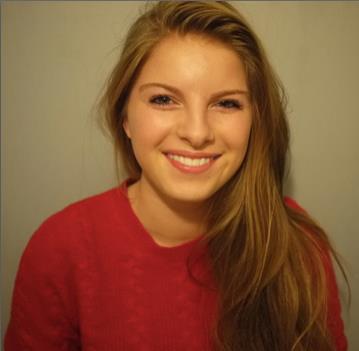
Maya Dolman Bowles (left) and a screen shot of Rachelle Lefevre (right) from the film 'The Caller''.
Our media product presents our main character as a young blonde women, conforming to the stereotypical view of this social group by being vulnerable and unable to cope independently.
The 2010 Thriller film 'The Caller'
starring Rachelle Lefevre.
In the film 'The Caller', Rachelle Lefevre, plays a young blonde 'Mary Kee', a troubled divorcee who receives numerous mysterious and sinister phone calls from a strange woman.
This is a typical female character in a Thriller as she becomes mentally unstable and is then supported with the help of a man.
The role of this character in the film is to represent the stereotypical social group of young blonde middle class women, in this case, attempting to recover psychologically from her divorce and establishes her own life again once she meets a good-looking male college teacher.
This character's role and appearance is similar to the one in our Thriller as they are both young, attractive blonde women who are psychologically unstable and are vulnerable when threatened by a implied danger in the film.
Both character's have clothing of plain colours, to show their normality from their appearance but there are unknown psychological problems which the audience don't recognise when first seeing the protagonist.
In this clip, the character 'Mary Kee' is seen as being vulnerable as the clip shows her moving into a new house on her own, and she begins to get mysterious phone calls which unnerve her as the film progresses.
Maya Dolman Bowles (left) and a screen shot of Rebecca De Mornay (right) from the film
"The Hand That Rocks the Cradle".
The 1992 Thriller film 'The Hand That
Rocks the Cradle' where Rebecca De Mornay
plays a twisted woman.
In the film, "The Hand That Rocks the Cradle" Rebecca De Mornay plays, "Peyton Flanders", a vengeful nanny who is out to destroy a naive woman's happy lifestyle and steal her family.
This puts a twist on the stereotypical view of blonde female social group's, seen in most mainstream Thriller's and challenges the stereotype as she is the evil character, although she has psychological problems, she isn't vulnerable and acts as the threat to the other characters.
Her appearance is similar to the protagonist in our Thriller as again, she is an attractive blonde woman who on the surface seems like a ordinary woman but as the audience find out, she is a manipulative and evil character.
The role of Peyton Flanders represents one to show how woman can become extremely mentally unstable due to a tragic life situation, in this case, having a miscarriage.
Shot of the newspaper pushed through the letterbox,
shortly after the girl dreams of the murder
We mostly relied on props to show the audience what the storyline will involve but we also used the dream that the girl has to set the storyline up with the idea of premintion. We involved a main part of the girl's persona and character in the opening as we thought it was vital for the film's storyline and the audience needed to be able to understand the problems with the girl's mental state.
The dark shots used of a knife under the bright shots of
the girl implies something hidden behind the
girl's life that is about to happen.
Similarly, in 'The Caller', the 5 second shot of the telephone opens the storyline up as the film title implies, a telephone will play an important role in the storyline.
2) How character's are introduced
Mysterious figure, in the opening of Cape Fear
We chose to introduce the protagonist subtley without revealing their full appearance in the first shot to add ambiguity and to intrigue the audience. We used a panning shot of the bedroom at a low level and the music at this point is quiet, only with a atmospheric drone, suggesting depth to the character. A similar technique is used in Cape Fear in the opening, where we only see the character's figure. This is a convention often used and seen in mainstream Thriller films, especially in the opening as it continues the suspense and ambiguity of who will be involved and what might happen.
3) Genre and how the opening suggests it
We used hints to suggest the genre of our Thriller with props, adding them into certain shots such as this one so the audience could recognise the genre. In our product research, we noticed what conventions of a Thriller are used to imply a certain theme, i.e. red wine = violence, bright light = clinical. The pill box used in our opening is a typical prop used to suggest to the audience a type of psychological or mental instability which is what we wanted to make clear. Also, the lighting in this shot shows the medication being a vital component in the character's life as the clock is in darkness and a lot of light is shining on the pill box.
Similarly, in this scene from The Exorcist (1973), the religious Thriller
genre is expressed through the use of props, the cross and bible
on the bedside table.
4) Title font and style
"ALPACA54"
We spent time researching and taking note of certain title fonts that we thought were well suited to our themes. We found that the font "ALPACA54" which we downloaded from Dafont.com was well suited to our title as Precarious means instability or something that's likely to fall and collapse, the font corresponded with the title because it isn't in a straight format and the lettering has jagged edges. The vase gets pushed over and hits the title as it falls, I used the shatter effect on After Effects to make the title smash with the vase and become displaced, which foreshadows the plot involving our main character.
The font "Zapfino" was one which came with the iMac.
Another example of where we used the font, "Zapfino"
We decided that the font used for the titles would be in a handwritten style as we originally liked the idea of them appearing on the doctor's note as if they were signing it. Although we wouldn't be able to make the font realistic enough for it to look exactly like the doctor was signing the note, we were pleased with the outcome.
Similarly, in 'Psycho', the font used reflects the film including
the theme of there being faults in someone's
mental health.
5) Setting/location
The scene from Inception, with similar lighting to
some scenes of our opening.
We set our opening at a house with three locations, the bedroom, the bathroom and the hallway/dining room. We decided to use these locations as when we wrote the treatment, we thought that using rooms in an actual house would make it realistic and would give the audience a better insight into the main character's day to day routine, which was important to show as the character relies on medication. The bathroom was especially important as it is completely white tiling and the continuous white objects/surroundings was a key feature to suggest the medical/clinical situation. The lighting in the bedroom scenes was hard to get right as when we were filming during the daylight, there would often be graininess created, to fix this and to create a realistic nighttime scene, we used a bedside lamp to give a glow to the shots but not one which was too bright.
In the opening of Inception, a similar lighting is used which gave a sense of forthcoming danger and a suspenseful atmosphere.
6) Costumes and Props
An example of where the character is wearing plain clothing.
We used props carefully in our opening as we wanted them to represent a certain theme or narrative in the film. The use of white objects from the beginning is to run the continuous theme of medical issues throughout and to portray this to the audience, the doctors note is on white paper, the bedside table is white, the pill box is white, the bathroom is white etc. The clothing worn by the girl is plain and not very bright or interestingly patterned which we wanted to do so it wouldn't draw attention to it and so the audience would take more notice to the extensive use of white. The shot just before the girl knocks the vase over is important in the props department as the vase in the background is transparent, with white roses and a surrounding white area, this was used to contrast with the dark shadow on her hair and around her figure.
Screenshot from 'Se7en' opening.
Similarly in 'Se7en', props are used to imply themes such as obsession as there is a use of several shots including photos and film strips.
7) Special Effects
We used the cutaway effect on the dream to make it
clear that it's a dream and to show the contrast
of happiness/murder.
We used the effect 'cutaway' on iMovie 11 in this shot to create the effect of a flashback whilst the girl is reading the paper. This effect also foreshadowed the idea of the character being psychologically disturbed and unstable. We used jump cuts in the dream scene to disorientate the audience and to highlight that the girl is having a bad dream.
The cutaway effect being used in the opening
of 'Se7en'.
8) Camerawork and Editing
The jump cut used in the dream suggests that
there will be an interruption or problem involving her
and makes it quite disconcerting for the audience.
We wanted to show continuity to the girls daily routine in the opening and so we used a pan in the first shot and a slow zoom. To bring attention to the props on the bedside table, we used a tracking shot which is effective when trying to make sure that the audience pay attention to significant symbolism. We used a variety of shots but not many long shots as we wanted to show the intensity of the girls dream and the paranoia she feels. The close ups used of the pill box show the importance of them and the way that the character relies on them heavily in her life. We also used the cutaway effect to make the shots less tedious and repetitive to watch and we changed the effect on the dream shots in post production, to add a glowing and dreamlike feel so the audience could differentiate between the girl dreaming and the actual dream.
Screenshot from Hitchcocks, 'Vertigo'.
In Hitchocks, 'Vertigo', this aerial shot of the view from the top of a building is used to establish the main character's fear of heights, drawing attention to the main themes of the film, as the film's name 'Vertigo', is the name given to the feeling of dizziness when looking down from a great height. Similarly, we used certain close up shots and jump cut editing to highlight the main themes of the film.
We used a close up to emphasise the contrast of the blood
against the white clean floor. We also edited this in post
production to make the blood redder.
We used some transitions such as fade to black in between shots to add a smooth flow from shot to shot, we did this at the end of the opening but then decided to remove it as it added a sense of finality to the overall sequence which isn't what we wanted because an opening would then flow to the next sequence and it made it seem like this was the end of the film instead of an opening.
We used a tilt/tracking shot when revealing the
Doctors note to make the audience intrigued to what
it says.
In the shot where the vase is on the floor, surrounded by water/blood, we used short cuts from it being blood to water and back again to show the paranoia and distorted vision/mind of the girl.
9) Title of the film
We chose to have the title of the film at the end of the sequence as during post production we realised that it fitted really well with the shatter effect when the vase falls onto the floor. Before the vase gets knocked over, the black text against the white floor suggests the heavy contrast of the themes in our film, dreams/reality, sanity/insanity etc so it gave a sense of conflicting themes and stood out nicely. These contrasting colours are often seen in Thrillers, to symbolise different themes within the storyline. The fact that we used black text over the white floor also suggests the idea of some sort of darkness overriding the girls sanity and wellbeing. We wanted to include the title onto our shots instead of having a seperate slide for it as it was a nice composition for the title to be placed and appeared at the climax of the opening, emphasising the importance of the definition of the title to the film overall.
An example from a real product, the title is well embedded into the opening scene of 'Taxi Driver' (1976).


